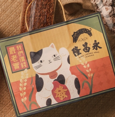
永昌隆紀念品設計
Veng Cheong Long Souvenir Design
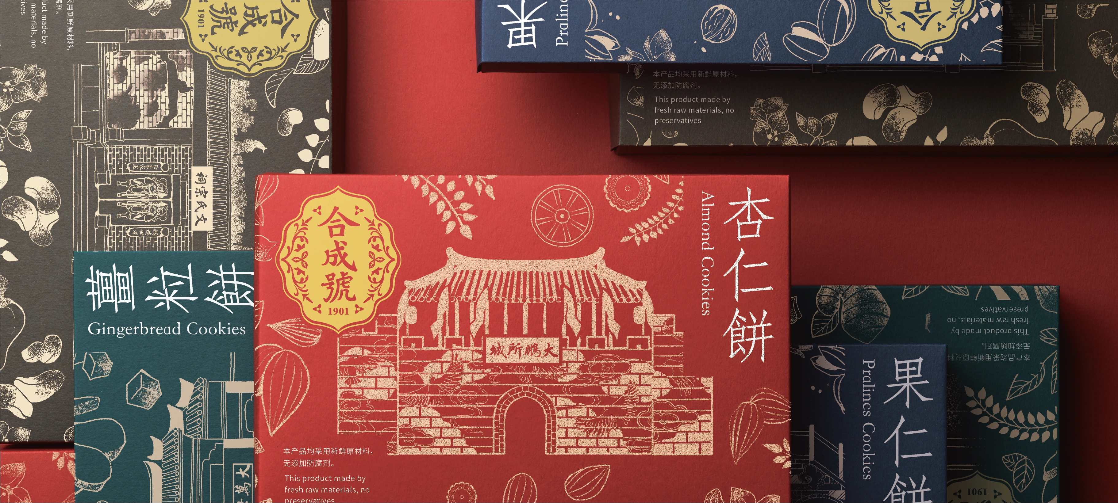
Hap Seng Hou Packaging Design
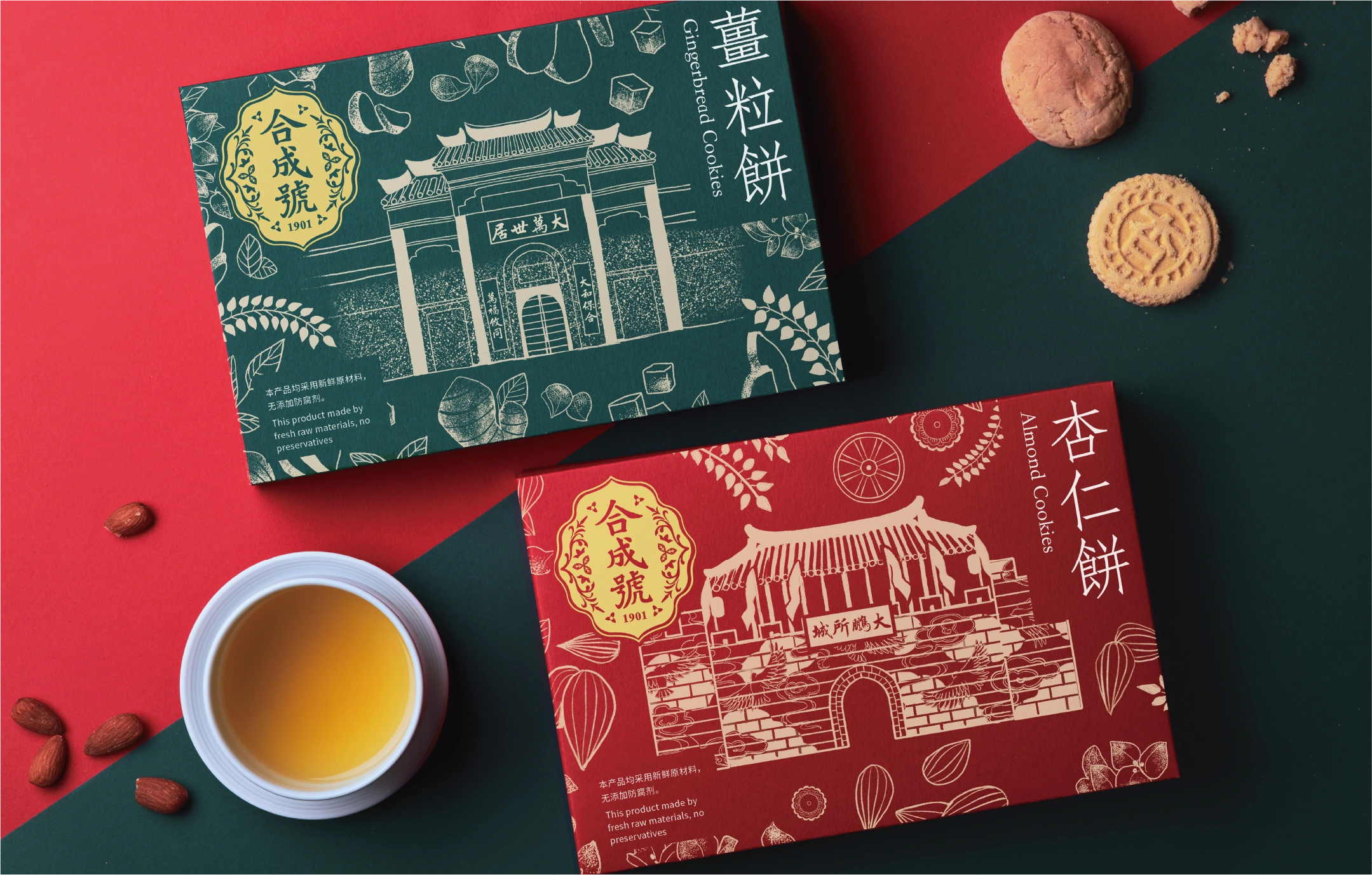
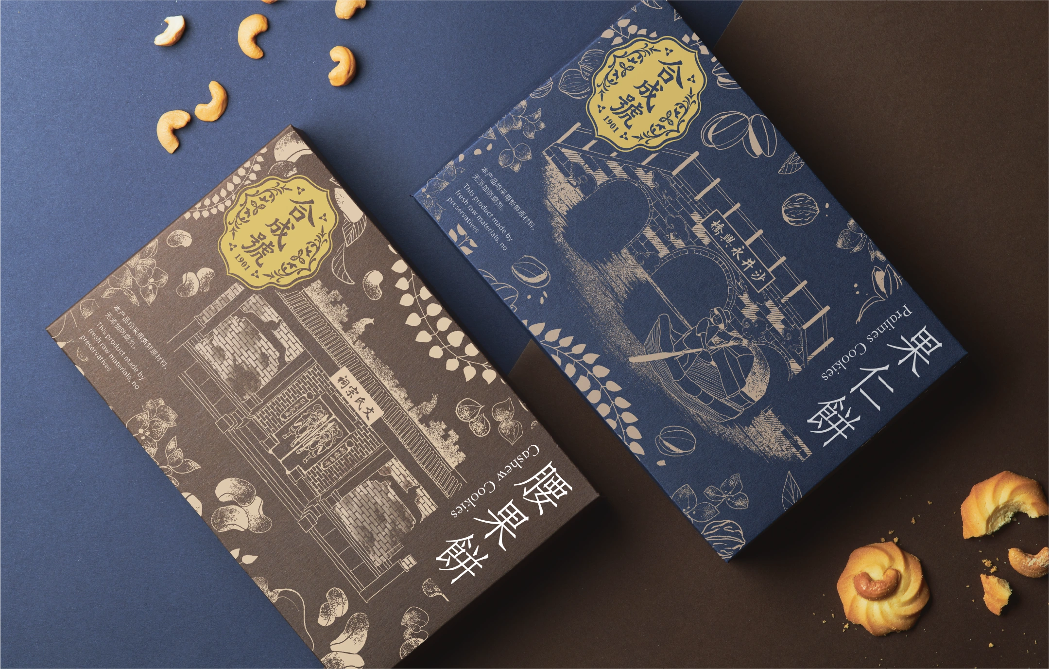
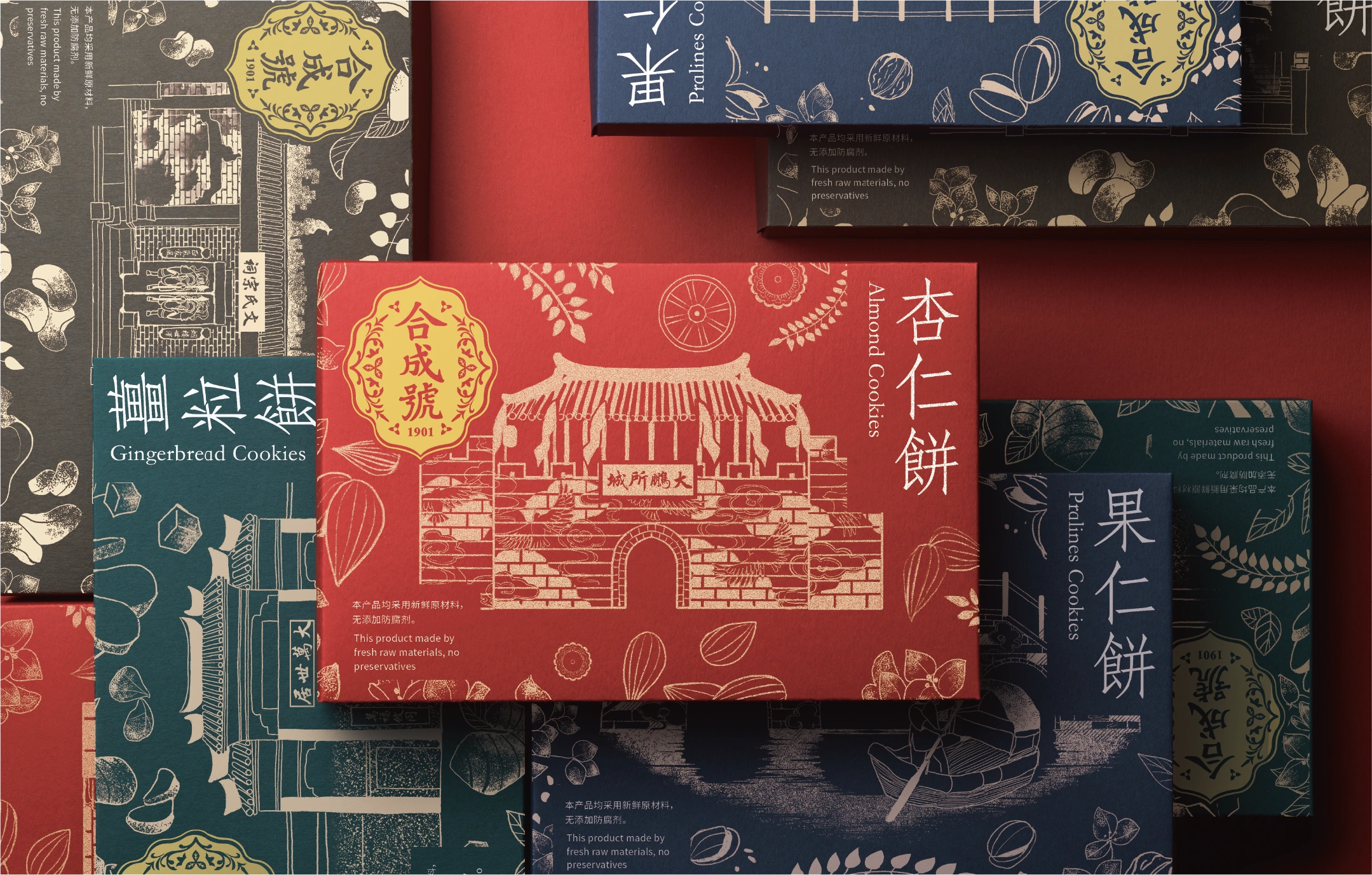
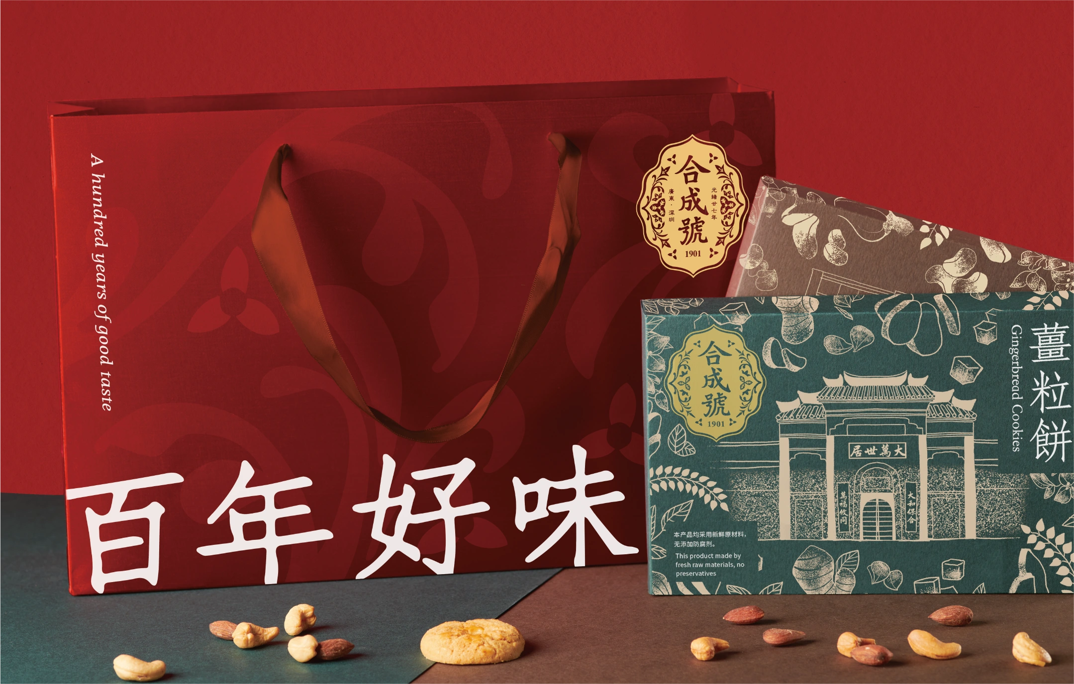
合成號是源自深圳的傳統餅食老字號,延續當地糕餅與小食文化。這套包裝結合深圳著名古建築、食材圖案與不同色彩,呈現各款餅食的特色,帶出品牌與地方文化的關係。 拍攝從包裝抽取深綠、紅、藍及啡色,利用色塊拼接與俯拍構圖,清楚呈現整個系列。餅食、果仁與茶杯的點綴,讓包裝與食用情境連結;適度的光影則保留紙盒及金色圖案的細節,呈現老字號沉穩而鮮明的形象。
Hap Seng Hou is a heritage pastry brand from Shenzhen, continuing the city’s tradition of local pastries and snacks. The packaging combines illustrations of Shenzhen’s historic buildings and ingredients with distinct colours to highlight each variety and express the brand’s connection to local culture. We drew on the packaging’s deep green, red, blue and brown palette, using blocks of colour and overhead compositions to present the collection clearly. Pastries, nuts and teacups connect the packaging to the experience of enjoying the food. Carefully controlled lighting reveals the details of the paper boxes and gold graphics, conveying the brand’s quiet confidence and distinctive character.
Veng Cheong Long Souvenir Design
Hap Seng Hou Packaging Design
A Lifetime of Happiness Together — Chinese Wedding Pastries

Lan Heong Kuok — Dragon Boat Festival Rice Dumplings
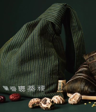
LAN HEONG Rice Dumpling Packaging
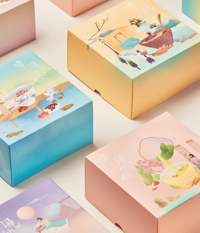
Warmth in a Bowl
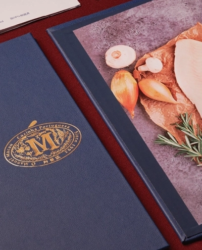
O Manuel Cozinha Portuguesa
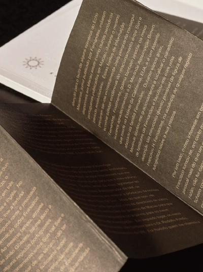
Francisco Hermenegildo Fernandes – O Camarada de Sun Yat Sen
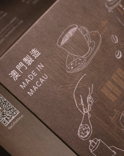
New Coffee – Drip Bag Coffee Packaging